• About me

The Library of Tomorrow

~ thoughts and reflections on the world of Library and Information Science

The Library of Tomorrow

Tag Archives: DITA

Self-reflection through DITA data analysis

09 Tuesday Dec 2014

Posted by Dominic in Information Architecture

≈ 5 Comments

Tags

data visualisation, DITA, Elena Villaespesa, Ernesto Priego, information architecture, text analysis, Twitter, Voyant Tools, WordPress

Well, after ten lectures, ten lab sessions and one reading week, the taught element of the DITA module is now over, with only the assignment left to complete and hand in. Before I started this module, a blog post reflecting on my experience would have been entirely qualitative—a simple description of my enjoyment of blogging and Tweeting, despite my previous hesitancy and even scepticism. However, if there’s one overarching theme that I’ve taken away from this module, it’s that everything I do online (and offline as well, for that matter) can be broken down into quantifiable data and be analysed using a variety of suitable tools. So, what better way to conclude my blog posts on this module by using some of these techniques on my own digital output?

Twitter
Let’s start with Twitter. From looking at my profile page, I can see that I (at the time of writing) have tweeted on 174 occasions, am following 177 accounts, have 77 followers, and have favourited 104 tweets. I can also scroll through each individual tweet that I have sent in order to see how many times (if any) it was retweeted or favourited by others. This is all very basic.

However, Twitter also provides its users with an analytics service, which—in addition to providing more detailed statistics pertaining to the above criteria—also provides a count of Impressions (defined as “the number of times users saw the tweet on Twitter”), Engagements (defined as “the total number of times a user has interacted with a tweet. This includes all clicks anywhere on the tweet[…]retweets, replies, follows, and favorites”), and the Engagement Rate (the number of Engagements divided by the total number of Impressions) for each individual tweet. For instance, this popular tweet about the course’s Christmas party yesterday evening has (so far) received 113 impressions and 62 engagements, giving an engagement rate of 54.9%. No doubt these figures will continue to change, especially as I have just interacted with it again in order to embed it in this post!

#citylis after party! pic.twitter.com/tOi9xsi6HN

— Dom Allington-Smith (@domallsmi) December 8, 2014

It is easy to see how Twitter Analytics can be of use to anyone with an account, especially those run by companies and institutions that are seeking maximum engagement with potential consumers. The detailed statistical information available allows the controller of the account to see what kind of tweets receive the most attention; for instance, those which include photos, links, or jokes.

As with several other websites that I have previously covered in this blog, Twitter analytics also allows for the raw data associated with the Twitter feed to be exported as a Comma Separated Values (csv) file into a spreadsheet for further analysis. (The data for my account is viewable here.) The spreadsheet—in the lab session yesterday we used an open-access template developed by Elena Villaespesa with the Tate and modified by Ernesto Priego—can then be used for further analysis. (Again, the data is viewable here For instance, it orders the top tweets by engagement rate for each month, so I can easily see that my top tweet for October was an advert for my earlier blog post on information retrieval—

My thoughts on yesterday's #dita lab experiment on searching techniques in information retrieval. http://t.co/iylT763KkM #citylis

— Dom Allington-Smith (@domallsmi) October 14, 2014

—and that my top post in November was a joke I made during the British Library Labs Symposium (although this has been influenced by the fact that I appear to have accidentally favourited my own tweet, a definite social media faux pas).

First it was the @MechCuratorBot , now @VictorianHumour 's Mechanical Comedian – how long before we get a Mechanical Librarian? #citylis

— Dom Allington-Smith (@domallsmi) November 3, 2014

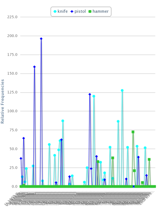
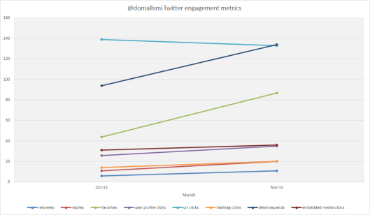
I can also use the figures to produce suitable visualisations: for instance, this breakdown of different types of Twitter interactions between October and November indicates an overall upward trend (31% according to the figures) driven largely by people favouriting my tweets and clicking on them to view more details on more occasions.

domallsmi Twitter engagement Oct-Nov

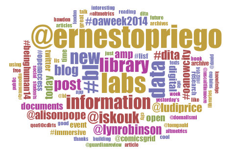
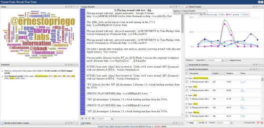
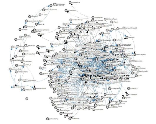
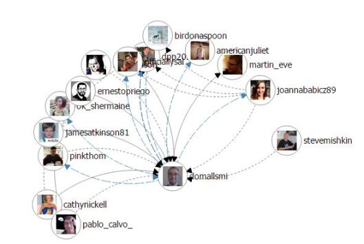
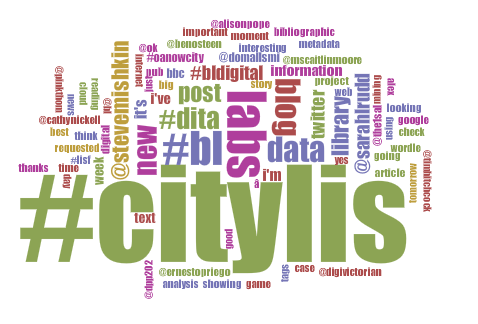
The raw data itself can also be subjected to text analysis: the Voyant Tools wordcloud quickly and intuitively reveals the hashtags I have used most often (no prizes for guessing that #citylis dominates!) and the users with whom I have had the most interactions.

voyant cirrus twitter domallsmi

WordPress
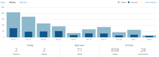
The other main facet of my self-expression this term has been this blog. Again looking at the most basic raw data, I can see that I have published 13 posts (not including this one), and that the blog has 33 followers, has been commented on 28 times (although many of these are my own pingbacks to previous posts), and has been viewed 898 times (this last figure is viewable by anyone as a widget at the foot of the page).

WordPress also provides an analytics page which allows bloggers to track metrics such as page views, referrals to the site, and links clicked on. So, for example, I can track the blog’s popularity over time, with reference to when I published certain posts (interestingly enough, the leanest period so far coincides with reading week!).

WordPress views

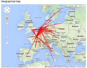
I can also see the global reach of the blog by viewing the geographical location by country of visitors displayed on a world map (I’m surprised by some of these!).

WordPress GIS

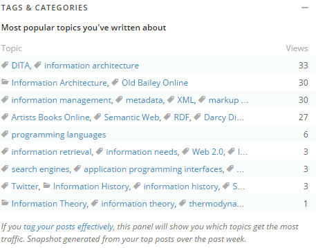
And as a final example, I can see which tags and categories are particularly possible. As with the Twitter case above, this could allow me to expand my readership as I could focus on the more interesting subjects. Unfortunately this feature only extends back one week.

WordPress tags

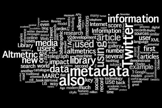
Unlike Twitter analytics, I cannot find a way to export this information for further analysis. However, I can copy-and-paste the content of each post to produce a Voyant word cloud.

voyant cirrus wordpress

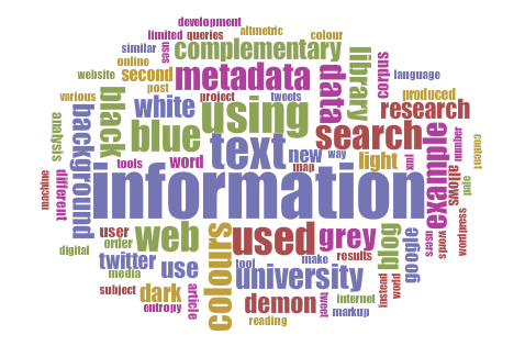
Whilst “information” is unsurprisingly the dominant topic, the prominence of numerous colour-related terms is less immediately explainable, and requires me to think back to this early post on the blog’s design and colour scheme Similarly, anyone puzzled by the appearance of the word “demon” in a blog about Library and Information Science should refer to this post on information theory with special reference to Maxwell’s Demon. As ever, data mining and text analysis, understood as forms of “distant reading”, must be further investigated by close reading and an understanding of context, although they do provide good starting-points for research and identification of underlying patterns.

Conclusion
I have very much enjoyed using both Twitter and WordPress, and I believe that the examples above help to illustrate my engagement on the former platform, and my diverse range of readers and subjects covered on the latter. I have also enjoyed the module as a whole, despite not coming from a technical background: it has been extremely useful to understand the basic technological principles (and, stemming from them, the wider socio-cultural implications) that underlie the work of the contemporary information professional.

I will definitely keep this blog running, although I imagine that the posting schedule will become less frequent and regular, particularly with Christmas coming up and assignment deadlines looming. On the other hand, it may also begin to cover a wider range of material. I can imagine, for example, that the blogging process will be very helpful in organising my thoughts when it comes to writing my dissertation later in the academic year. For now, though, thanks for reading, and please stay tuned for further posts!

To finish with, here is some suitably reflective music for you to enjoy.

Moving towards a Web of Meaning

01 Monday Dec 2014

Posted by Dominic in Information Architecture

≈ 3 Comments

Tags

Artists Books Online, authority control, BIBFRAME, Darcy DiNucci, DITA, Dublin Core Metadata Initiative, HTML, information architecture, information management, markup languages, metadata, Old Bailey Online, OWL, RDF, Semantic Web, Text Encoding Inititative, Tim Berners-Lee, W3C, Wikipedia, XML

The term “Web 2.0” was coined by Darcy DiNucci in 1999 and has gained credence during the 21st century. “Web 1.0” (which is of course a retronym as this term was not used at the time) pages were largely static, text-based and passively consumed by those who accessed them—with the notable exception of the hyperlink, they were essentially a continuation of a printed book, journal, newspaper article or a similar pre-Internet resources. In contrast, Web 2.0 was (and still is!) all about a dynamic, interactive user experience, involving multimedia messages, “mashups” of different website features using APIs, and user participation through social media, of which this blog is itself an example.

However, as interesting and meaningful as Web 2.0 may be to us, the human consumers, it is still flat and devoid of semantic information to our computers, the intermediaries. This is where the concept of the Semantic Web—also known as Web 3.0—comes in. It is a project spearheaded by the World Wide Web Consortium (W3C) and coined by Tim Berners-Lee, and aims to produce a Web of meaningful information (hence “semantic”) that can be understood—not just read—by machines. The technology that underlies this aim is the encoding of all text with metadata, using standard markup languages (such as XML) and controlled grammars and vocabularies (such as those provided by the Dublin Core Metadata Initiative). The meaningful metadata is added using linked data, which on the Internet is primarily achieved by using the standardised Resource Description Framework (RDF). RDF is used to describe entities using a tripartite Subject—Predicate—Object model. For example, Dominic Allington-Smith (subject) studies at (predicate) City University London (object). When properly marked-up, this enables a machine to understand the nature of the relationship between the three elements, whereas the Web 2.0 can only identify that a relationship exists without knowing its nature. Those of you who have read my previous post on library metadata standards in the Web 2.0 era may be interested to know that the emerging BIBFRAME bibliographic metadata standard is expressed in RDF.

An example of a series of RDF relationships displayed in graph form.  The blue ovals are subjects, the nodes predicates, and the beige rectangles are subjects (the lower two blue ovals are both objects and subjects).  The hierarchy is controlled by the underlying Taxonomy and any limitations by the Ontology (see below).

An example of a series of RDF relationships displayed in graph form. The blue ovals are subjects, the nodes predicates, and the beige rectangles are subjects (the lower two blue ovals are both objects and subjects). The Uniform Resource Identifiers (URIs) labelling the nodes link to standards which define the nature of the predicate. The hierarchy is controlled by the underlying Taxonomy and any limitations by the Ontology (see below).

Of course, markup languages have existed since the genesis of the Internet. One of the fundamental building blocks of the Web as we know it is the HyperText Markup Language (HTML), which is used to format webpages, but this is extremely limited as it does not distinguish the meaningful content of text, just how it should be presented. This can be demonstrated in the Google Chrome browser by pressing Ctrl+U when viewing this or any other page in this blog to view its source code—although the markup is extensive and pervasive, it only refers to how the page is displayed on the computer screen; not its semantic meaning. The concept of the Semantic Web is different, as all text is marked-up with meaningful metadata, forcing the machine reading it to make explicit interventions in order to interpret it, thus making it open to searching, analysis and to be placed into relationships with other texts in the corpus (I should point out that current search engines are inefficient by comparison, as they must make guesses—albeit increasingly well-educated ones—on the content of text that has not been marked-up based on context and collocation).

One way in which it may be useful to visualise the concept of the Semantic Web is by referring to the ill-fated Allwiki campaign, an argument during the early years of Wikipedia that every single word in an article should be linked to another Wikipedia article, or its definition on sister project Wiktionary, instead of the accepted current model. The Semantic Web, however, is different: whereas linking every single word in a Wikipedia article is immediately obvious to the human reader, the XML or similar markup language that can be used to encode the entire contents of a webpage is not visible in the human-readable interface, and is instead only intended for consumption by the machine that uses the information to display, search (and so forth) the page.

Although the vast majority of the content available through the Internet is currently not semantic, many research projects exist that have marked-up their entire corpora of source material, digitised or otherwise, with metadata, using the principles laid out by the Text Encoding Initiative. This gives us an idea of how Web 3.0 could look. Due to the customisations needed for supporting the Semantic Web when dealing with different disciplines, contexts and so forth, it is also necessary to create a Document Type Definition, a Taxonomy (a hierarchical organisation of concepts derived from the RDF metadata suitable for use with the hierarchical nature of XML), and an Ontology (a collection of logical rules and inferences that can be applied to the Taxonomy, for example X did not influence Y if X lived before Y) in the Web Ontology Language (OWL).

The first of these research projects is the Old Bailey Online archive (used last week!). Its corpus of court cases and supplementary material has been entirely marked-up—using both manual and computerised processes—in order so that it may be searched more effectively. For an example, let us refer to the trial of Thomas Smith for murder in 1760: the link shows the digitised natural language text (with links to scans of the original, handwritten records), and this one shows the same text with its structured, hierarchical metadata included in XML. The extensive use of hierarchical categories of information using a customised, controlled vocabulary, means that the site can use a complex, faceted search engine to make best research use of the entire corpus. As I demonstrated last week, this XML data can also be exported into Voyant Tools for further analysis.

The second such project is Artists’ Books Online, “an online repository of facsimiles, metadata, and criticism”. The “About the Project” page provides full and detailed information about the website’s DTD, metadata, taxonomy, markup scheme, and other technical information. It is unfortunately not possible to view each repository item’s metadata in the XML format, but a sample markup webpage allows us to compare a sample of the machine-readable semantic metadata in XML (and some presentation information in HTML):

Damaged Spring XML

Compare with the beginning of the human-readable output on the same item’s normal webpage listing:

Damaged Spring output

As with the Old Bailey Online project, the inclusion of meaningful metadata as an integral part of the webpage’s text allows for much greater efficiency in searching for, and comparing between, different sections of the total research corpus. Applying these principles to the entirety of the Internet may seem like a distant dream, but the rate of technological progress and innovation that resulted in Web 1.0 and 2.0 must surely make the realisation of Version 3.0 achievable.

At the coalface of information

25 Tuesday Nov 2014

Posted by Dominic in Information Architecture

≈ 3 Comments

Tags

application programming interfaces, Big Data, Christiaan Huygens, data mining, data visualisation, datasets, Digital Humanities, DITA, Franco Moretti, Google Books, information architecture, information law, Old Bailey Online, programming languages, search engines, text analysis, Voyant Tools, Zotero

After last week’s experiments with word clouds and other forms of text analysis, our class took a step back yesterday to look at the wider implications of data mining (of which text analysis is a subset). These include questions of representation and of legality—for example, should data mining be exempt from copyright laws, allowing researchers to access full texts of copyrighted works in order to feed them through computer programmes and applications, with only the general conclusions being made available to the public instead of full individual texts?

Google Books’s ongoing digitisation project is a good example of the legal challenges involved; the associated website includes a brief (and self-justifying!) outline. It is worth bearing in mind that the aims of this particular project go beyond data mining, but one of the most visible outcomes is the creation of the Google Books Ngram Viewer, a tool which allows anyone to search the entire corpus of digitised material for certain words or phrases, in order to find out their levels of incidence (a technique given the name “n-gram”). The viewer covers the years 1800 to 2008 and incorporates corpora in various languages. The total number of books in the various corpora was 5.2&nsbp;million in 2012 and is growing rapidly; it still represents a small fraction of the total number of texts published or still available, but one that is becoming ever-increasingly representative of this total. Some institutions, such as the Royal Dutch Library (Koninklijke Bibliotheek) have also used the tool’s API to create their own “mashups”—in this case, a Dutch-language version of the tool with its own corpus.

The Google Books Ngram Viewer can be used, in a manner similar to word clouds, to provide a quick and easy-to-understand overview of the criteria searched for. For example, this search of the most notable leaders of the Soviet Union/Russian Federation since the October Revolution in 1917 produces the following results from Google’s English corpus, showing rapid rises for each new leader as he assumed power, followed by either sustained or transient interest thereafter. One can easily imagine a humanities scholar using the tool as a starting-point for further research (perhaps using the further links to precise listings within Google Books that are conveniently placed underneath the generated graph!).

Google Books Ngram Viewer Russian leaders

The tool can also be useful for LIS research: this graph shows the n-gram trends for several literacy concepts that we discussed in our Foundation module last week.

The graphs can also be embedded using an API, but not in WordPress.com thanks to its limited HTML functionality!

The graphs can also be embedded using an API, but not in WordPress.com thanks to its limited HTML functionality! (Please click to enlarge.)

Many of the institutions and publishers that do collaborate with Google perhaps do so reluctantly, unwilling to take on a corporate behemoth of such immense proportions. However, there are many examples of research projects in which the corpus, data mining and text analysis are carried out with much greater co-operation. One of these is Old Bailey Online, a project funded and otherwise supported by a variety of institutions and sources, which provides a digital archive of the court’s proceedings between 1674 and 1913. The website has a search engine, but also an API Demonstrator, which allows the results of interrogations of the database to be exported to the reference management system, Zotero, and the Voyant Tools suite of applications for data visualisation which I used last week.

It is therefore possible to carry out complex searches, analyse the results at a superficial level (yet one that can identify key research questions), before going through particularly interesting texts within the corpus in more detail. This is conventional “close reading”; the newer methods of data mining and text analysis have been referred to as “distant reading” by the digital humanities scholar, Franco Moretti.

One of the reasons for making the archive publicly available is so that those with an interest in genealogy can research their family history; sadly, my almost-unique surname restricts me from carrying out a search based on such principles without further research into my family history! Nevertheless, a search of the complete archive for cases in which someone was found guilty of “wounding”, but also found to be “insane”, produced a corpus which I was able to visualise using a number of methods: for example, in addition to the word clouds covered last week, I produced a graph showing the incidence of different weapons commonly used in the corpus of cases (which is listed in chronological order).

The keywords can then be further analysed with a collocation tool, and by close reading in the corpus reader.

The keywords can then be further analysed with a collocation tool, and by close reading in the corpus reader.

During this process, I noticed that the integration between Old Bailey Online and Voyant Tools was particularly impressive: the export interface was extremely easy to use, and the common English stopwords list was applied automatically (which is not the case if the text is entered manually, as was the case last week).

Some research projects take this process a stage further, and create their own customised data mining and data visualisation tools to integrate all aspects of the project within the same digital framework. Although this takes a significant amount of work, it also produces potentially the most convenient and “future-proof” (in the sense that a project does not have to rely upon an external partner). The Dutch Utrect University currently has several text-mining research projects listed on its Digital Humanities website. Unfortunately, many of them are still in the early stages of development and do not provide access to the data being used, but a good example is the Circulation of Knowledge and Learned Practices in the 17th-century Dutch Republic (CKCC) project, whose corpus comprises 20,000 letters sent between seventeenth-century scholars (mostly) resident in the Dutch Republic.

The project, again funded by grants from an assortment of sponsors, is clear in its aims:

One of the main targets of this project is to create free, online access to historical sources, open to researchers from various disciplines all over the world. Unlike earlier printed editions of correspondences, this source is not static but of a highly dynamic nature, making it possible for the scholarly community to discuss problems, share information and add transcriptions or footnotes. One of the great advantages of this project is its ability to invoke new questions, new interpretations and new information, and to bring all this together on an expanding website.

To this end, the project’s website includes a Virtual Research Environment (VRE)—the ePistolarium—which allows anyone to search the corpus and produce visualisations from the data produced. The search engine offers a plethora of options: one can search by sender, recipient (or combine the two), people named in the letter, geographical location of sender or recipient, and date. There is also an algorithm that allows for a similarity search, whereby letters are ranked and retrieved based on similarities within the text.

A search for the complete correspondence available of Christiaan Huygens—one of the most prominent and well-represented individuals within the corpus—produces a list of results which can be ordered using six different criteria: date, sender, recipient, sender location, recipient location, and text search score (if performing a free text search in the body of the letters). The transcribed contents of each individual letter can also be read, along with its associated metadata, important keywords, and similar texts that are retrieved using the aforementioned similarity search tool. Each letter can also be sent to an e-mail address, or be shared on Facebook or Twitter, but unfortunately there are no permalinks as yet. The search results as a whole can also be exported as a CSV (Comma Separated Values) file, for those who may wish to perform their own further analysis.

This would appear to be unnecessary, however, as the project has several different data visualisation tools that are fully integrated with the VRE. (The output for each visualisation is also available to download in JSON format, although it is not yet possible to embed any of them using an API.) The first of these is a map, in which the geographic location metadata associated with each letter is used to plot lines between senders and recipients on a map, in this case the correspondence of Huygens:

CKCC Huygens map

A movable timeline, in three different scales, allows the user to view patterns of Huygens’s correspondence in chronological order:

CKCC Huygens timeline

A network visualisation shows all the individuals to whom Huygens sent letters, and from whom he received them.

CKCC Huygens correspondence

Finally, a “cocitation graph” shows the names of individuals, contemporary or otherwise, who feature in the correspondence. I believe that this visualisation is of the greatest value, as it allows us to view those who could be described as the intellectual influencers of Huygens and his peers, and acts as a useful starting-point for further research on this topic, which would involve close reading of the letters themselves. The project’s website includes a page of initial research experiments conducted with the tool.

CKCC Huygens cocitation

(Committed readers of this blog may notice a certain similarity between these latter two visualisations and those produced by the TAGS Explorer tool that I wrote about some weeks ago.)


It is clear from my own experience with these projects, and the topics that I have covered in previous blog posts, that the “distant reading” of large-scale datasets through various forms of data mining is a crucial part of contemporary humanities research. Our role as information professionals must therefore be to fully understand these tools and technologies in order to further advance the knowledge that can be produced, or at least assisted in producing, by them throughout academia and the wider world. It is worth noting once more, however, that these techniques should be used to supplement traditional research, so we must also endeavour to keep our feet on the ground whilst doing so.

Screwing around with text analysis

18 Tuesday Nov 2014

Posted by Dominic in Information Architecture

≈ 5 Comments

Tags

Altmetric, altmetrics, data visualisation, datasets, Digital Humanities, DITA, Geoffrey Rockwell, infographics, information architecture, information overload, Jacob Harris, Julie Meloni, Stefan Sinclair, Stephen Ramsay, TAGS, text analysis, Twitter, Voyant Tools, Wordle

The title of this blog post is not flippant, but is in fact taken from a chapter of a recently-published book, entitled The Hermeneutics of Screwing Around; or What You Do with a Million Books, by Stephen Ramsay. Ramsay discusses how the concept of epistemological order—in his words, the “coherent, authoritative path through what is known”—has evolved over time, and recently been completely transformed entirely by the emergence and insatiable growth of the Internet. The essential premise of our current situation is that there now is far too much information, even on the most specialised subjects, for any one person to take in during his or her lifetime; however, new digital technologies allow us to explore the information in alternative ways.

One of these ways is text analysis. This involves feeding a corpus, or body, of text(s) through a computer programme in order to discover various conclusions that would not be apparent at first glance, or would otherwise have been prohibitively expensive and time-consuming to be carried out by human effort alone. For instance, a basic method of text analysis is counting the frequency of words that appear in a text; the information, which only takes a few seconds to compute, even for a corpus of thousands of words, can be displayed visually in the form of a word cloud. The word cloud currently produced by the RSS feed of this blog (which excludes the older posts) looks like this:

All apparently on-topic for a LIS student!

All apparently on-topic for a LIS student!

This word cloud was produced by Wordle, a widely-known and well-used JavaScript tool that performs this very basic level of text analysis. Wordle in fact refers to itself as a “toy” rather than a “tool”, but it provides a firm foundation for those getting involved in these methods for the first time. Indeed, Julie Meloni refers to it as “the gateway drug to textual analysis” in her blog post on the application’s uses in an education environment. Wordle’s addictiveness is enhanced by the fact that it is customisable at an aesthetic level—the colours, font and basic layout of the cloud can all be changed (hence the colour scheme to match my blog theme).

Wordle, however, is limited in other ways. I can demonstrate this by using the archive of data that I began exporting from Twitter a few weeks ago using TAGS (which has since been growing, as additional Tweets matching the criteria are automatically added every hour). Feeding the corpus consisting of the Tweets (all of which feature the hashtag #citylis, remember) into Wordle produces this word cloud (using exactly the same aesthetics as before):

#citylis wordle

This unwelcome result has occurred because of Worldle’s customisation limitations. Text analysis normally makes use of stopwords—extremely common words such as “the”, “a”, “and” and so forthwhich are not included in the computation. Wordle’s default stoplist does omit these words, but it cannot be edited to suit the needs of each individual word cloud; hence, this one is (as you would expect) dominated by the hashtag “citylis” that links the dataset together, whilst other Twitter jargon such as “RT” (retweet) and “MT” (modified tweet) is also visible.

Fortunately, other, more advanced, tools exist for text analysis. The best of those that I have come across so far is Voyant Tools (initially given the unfortunate name of Voyeur Tools), which is still under development by its creators, Geoffrey Rockwell and Stefan Sinclair, but offers significantly more options. Using the same citylis corpus and removing the unwanted stopwords produces a more meaningful visualisation, which clearly shows the most prolific Tweeters and the most common other hashtags used:

#citylis stopwords removed voyant

Unlike Wordle, the colours, fonts etc. cannot be modified.

Voyant’s tools also extend beyond the word cloud, including a full text reader, a word trends graph, and the ability to locate individual words and see them in context (known as collocation), as can be seen from the screenshot of the entire interface below. This has the potential for more extensive meaningful analysis: for example, looking at the word trends graph, it is clear that there is a spike in activity for the words “lab” and “#bl”—my classmate, Daniel van Strien, explains why here. Another of my classmates, Rachel Giles, has also used Voyant’s ability to customise stopwords to produce more meaningful information about her dataset of cancer-related health journal articles from Altmetric.

There are additional tools not visible in this screenshot, or in development.

There are more tools not visible in this screenshot, or in development.

This is only barely scratching the surface of text analysis, and I will post more on the subject next week as we explore the closely related technique of text mining. What is particularly exciting about text analysis is that it lends itself best to humanities research due to its focus on the written word, but is the complete opposite of the traditional “close-reading” approach due to its use of large datasets. These disciplines have traditionally been exclusively qualitative in nature, and so using what is a quantitative method to analyse the source material has the potential to open up a new wealth of opportunities for research and data visualisation, collectively known as the Digital Humanities. One interesting and freely-accessible example is this The Lord of the Rings project, which has analysed the complete text of the novel (plus J.R.R. Tolkien’s other works in some cases) to produce a range of relevant infographics.

However, I will nevertheless end on a note of caution. Analysing information in this way risks losing the context that underlies it, and visually appealing infographics such as word clouds can be used when they are not necessary at the expense of a more informative presentation, as Jacob Harris demonstrates with a comparison using the same dataset. As with several other aspects of this module, therefore, I would advise that this technique is used to supplement more traditional methods of achieving the same end, not to replace them.

Altmetrics in academia

12 Wednesday Nov 2014

Posted by Dominic in Information Architecture

≈ 4 Comments

Tags

Altmetric, altmetrics, application programming interfaces, databases, digital divide, DITA, Ernesto Priego, information architecture, information society, JSON, markup languages, reference managers, social media

In the world of academia, the “impact” of scholarly articles has traditionally been measured using citation counts—how often an article is cited in a subsequent article. However, the development of the Internet has challenged this model: the immediacy of social media has allowed for greater and quicker collaboration between academics that exposes the much longer timeframe needed for new articles to be published and their citations to be counted and linked back to the original sources; and the growth of digital repositories has enabled the dissemination of articles outside of the traditional media of academic journals, and to a more diverse, potentially non-academic audience as well.

In recent years, therefore, altmetrics (alternative metrics) have come to the forefront of measuring impact. They are not intended as a replacement for counting citations in order to measure academic impact, but instead as a complementary technique to quantify societal impact. In practice, these new metrics cover elements such as the number of views that an article published online receives; the number of times that it is downloaded; and the number of times that it is “shared”. The latter category includes mentions in news media, social media, blogs, and uses in reference managers such as Mendeley and CiteULike.

There are several providers of altmetrics that have appeared in the last few years: the one that we used in our most recent DITA class is called—appropriately enough—Altmetric (founded in 2011, it now handles approximately 2.5 million requests per day). The way in which it works combines many of the areas that we have learnt about already (and several of which I have previously posted about in this blog): Altmetric maintains a relational database of both online academic publishers—to track the appearance of new articles–and news websites–to track mentions of these articles in the media; it then uses a mashup of Application Programming Interfaces (APIs) from social media platforms, such as Facebook and Twitter, and the aforementioned reference managers, to harvest their data outputs in the JavaScript Object Notation (JSON) markup language from which it produces its own JSON output. This can then be exported to a programme like Microsoft Excel as a comma separated values (csv) file for further analysis and manipulation.

The purpose of Altmetric is that it gives each article that it encounters a score, denoting its impact, according to how often it is shared in news and social media platforms, and saved in reference manager software. The score is not simply a cumulative total, but is instead calculated using an algorithm (that gives different sources different values according to how important a panel of experts believes that source to be in communicating academic information, and also rewards a wide breadth of sources: for instance, an article shared several thousand times on Facebook will be likely to have a lower score than another that is has only a few hundred mentions, but across several social media platforms and in traditional news media websites). As a quick visual aid to indicate the diversity of an article’s societal impact, Altmetric uses a modified version of its rainbow-coloured logo for each article: the example below shows an article with a variety of sources, and therefore colours, (top) compared to one which relies solely on one source, Facebook, for its impact (bottom).

Altmetric contrast

(The first article has a total of 245 mentions; the second has 2546, but receives a lower score due to Altmetric’s algorithm.)

So how useful are altmetrics? The success of Altmetric and its competitors in the industry certainly indicates their popularity: not only can the scores produced be used by academics to research their field (and LIS students!), but also by the authors of articles to demonstrate their credentials, by universities to demonstrate their faculties’ credentials, and by publishers to demonstrate their writers’ credentials. Altmetric not only provides its scores in a searchable browser-based application, but also sells its API to institutions: for example, City University London’s digital repository has an Altmetric score for each of its deposited items, in addition to buttons for online sharing and its own altmetric (number of downloads).

However, there are several potential problems. Most obviously, altmetrics do not take into account the qualitative value of an article, merely its quantitative impact. As Altmetric itself is at pains to point out, with a large red box in its “How is the Altmetric score calculated?” help-page:

The Altmetric score is useful to rank articles based on attention – it can’t tell you anything about the quality of the article itself, though reading the linked discussions might.

A good example of these limitations is the fact that the current holder of the record for the highest Altmetric score of all time is a humorous article about psychiatry in the world of Winnie-the-Pooh: not of much value for research, but likely to attract a great deal of superficial attention due to its offbeat subject matter. To further demonstrate the point, when doing my own searching, I found another frivolous yet popular article on the disappearance of teaspoons from an Australian research institute. It is therefore vital to take the data provided by altmetrics with a grain of salt; to place it in a wider context and to use it in conjunction with the traditional citation-counting.

Furthermore, Altmetric is limited by the number of potential sources that it can monitor effectively in its database. It also limits itself to articles that have a digital object identifier (DOI) or similar record, which excludes those journals that opt not to use one. There is also the question of subject bias: in the searches that I have performed using the service, I have noticed a distinct bias towards the sciences, particularly medicine, at the expense of the humanities. For instance, of the current top ten-scored articles listed under the subject “Library and Information Studies”, five (including the top two) are concerned primarily with medicine and healthcare with no obvious connection to LIS.

Finally, our own module leader, Ernesto Priego, has written on the subject of how altmetrics may be influenced by digital opportunity: in a world where Internet use is still dominated by first-world countries, with a clear correlation to their performance in the Digital Opportunity Index, does using altmetrics reinforce a Western-centric view of academia by paying the greatest attention to those who already possess the greatest means of making themselves heard?

It seems clear to me that, although altmetrics have proven themselves valuable in keeping the world of academia apace with the wider societal and informational developments stimulated by the growth of the Internet, they are not a panacea: they should be used in conjunction with older techniques, and further research is necessary into new methods that have yet to be determined. However, as altmetrics—a very young technology, don’t forget–continue to develop and become further integrated into the established paradigm, then hopefully some of the problems I have mentioned should become less severe in any case.

Mapping the Twitterverse

02 Sunday Nov 2014

Posted by Dominic in Information Architecture

≈ 6 Comments

Tags

Andy Baio, application programming interfaces, Big Data, data manipulation, data visualisation, datasets, Dhiraj Murthy, DITA, Google Sheets, information architecture, JSON, markup languages, Martin Hawksey, metadata, Raffi Krikorian, social media, TAGS, Twitter

In an information era defined by an exponential growth in data output, fuelled by the connective and interactive technology possibilities provided by the Internet, there is perhaps no better exemplar of these phenomena than Twitter. Twitter is a social media website that allows its users to send short (140 characters or fewer) messages (“tweets”) that can be viewed instantly be their followers, or by other users searching for particular words or phrases. The scale of the enterprise is vast: Twitter estimates that it has 284 million active montly users, and that 500 million tweets are sent by these users every day. Despite the brevity of each message, each also contains a great deal of associated metadata, as shown by this “Map of a Tweet” (in the markup language JSON) produced by Twitter developer Raffi Krikorian.

Four more years. pic.twitter.com/bAJE6Vom

— Barack Obama (@BarackObama) November 7, 2012

(The most re-tweeted tweet of 2012.)

Twitter’s importance in contemporary culture can be seen in its use by political leaders the world over (a verified list includes a total of 66). The role of Twitter, and other forms of social media, in influencing world events such as the Arab Spring has also been well discussed and documented, and its sociological implications are being studied by academics such as Dhiraj Murthy. This makes it a valuable tool for scholarly research, but there is a key problem that must be overcome: Twitter’s main strengths as a communications medium—its timeliness, conciseness and immediacy—and its popularity mean that older Tweets are continually buried beneath successive waves of newer ones. The site’s own search function is notoriously limited (only extending back for one week, for example), and despite recent improvements, is still not capable of producing useful data. For instance, searching for mentions of an extremely popular hashtag (a Twitter tool used to denote key words or phrases, e.g. #citylis, City University London’s Library and Information Science course) will not return all of the possible results due to bandwidth limitations imposed on individual user queries.

However, using the technological possibilities opened up by APIs (as first mentioned in a previous post). A user can create their own Twitter app to gain access to the Twitter platform (under strict conditions), and, using the ingenious TAGS tool, developed by Martin Hawksey, which in turn uses the APIs of Twitter and Google Sheets (an online spreadsheet programme similar to Microsoft Excel) to automatically export the metadata—encoded in JSON—of selected Tweets (usually filtered by hashtag) into a database. One of my classmates, Daniel van Strien, has written more fully on the technicalities of how this is done, and I recommend that you read his blog to find out more.

These API processes result in a Google Sheets document which consists of four spreadsheets:

  1. A “Readme/Settings” sheet that the user manipulates to set the search parameters, and including links to data visualisation tools (more on which later).
  2. An “Archive” sheet, consisting of the tabulated metadata of each tweet retrieved.
  3. A “Summary” sheet, listing users by number of Tweets about the desired hashtag, word or phrase, and also including other basic information derived from the Archive.
  4. A “Dashboard” sheet, consisting of the Archive data presented in graph and chart form.

My TAGS Google Sheets document, which is used to search for the #citylis hashtag, can be viewed here.

Perhaps the most compelling results of TAGS, however, is the creation of tools to further manipulate and visualise the raw metadata. TAGS Archive creates something that looks, superficially at least, like a standard Twitter feed, but is in fact a fully-preserved archive of Tweets on the given search term that can also be filtered by screen name or tweet content, or searched for chronologically, far more effectively than by using Twitter’s own search interface. TAGS Explorer is even more visually exciting, as it creates a map of interactions between all of the different users who have used the search term.

This is particularly useful as it clearly demonstrates Twitter activity—within the chosen parameters—over time. Another of my classmates, Shermaine Waugh, tweeted this image last Monday (October 27), showing a map of tweet replies between users within #citylis:

Citylis' Top Tweeters! #citylis #woah pic.twitter.com/P90qguxiNQ

— Shermaine Waugh (@ok_shermaine) October 27, 2014

The equivalent image from today (November 2), indicates that new links have appeared and that existing ones have been strengthened, after a further six days of Twitter activity (another advantage of using TAGS is that all tweets from the moment of the automated programme being set up are retained, not just those sent seven days prior to the most recent export of data being carried out):

citylis tweet reply map 02-11-2014

TAGS Explorer also allows the user to create more complex maps by including mentions (when a Twitter user mentions another user’s screen name in one of their Tweets):

citylis tweet reply mention map 02-11-2014

An even more intricate map can be included by also including retweets (when a user republishes another user’s tweet without modification):

citylis tweet reply mention retweet map 02-11-2014

Finally, every node in the network can be clicked on to view each individual Twitter user’s interactions with the wider group (this can even be animated!), in this case myself:

citylis tweet map domallsmi 02-11-2014

These examples have all been rather self-indulgent; only of use to someone encountering these tools for the first time (or perhaps a future historian researching how Twitter was integrated into LIS university courses in the early 21st century? I can dream!), but these visualisation principles can also be applied to areas of more value for scholarly research, or indeed public interest. For example, I mentioned the Arab Spring earlier, and this video shows the activity, in real-time, concerning the #jan25 hashtag at the moment of former President Hosni Mubarak’s resignation:

Another example concerns Twitter itself, specifically its use in the current “Gamergate” controversy. American technologist and blogger, Andy Baio, used a set of 316,669 tweets and their associated metadata to produce a series of data visualisations in order to demonstrate a series of illuminating conclusions.

It is clear that Twitter offers a great variety of research possibilities and I am very much looking forward to continuing on this theme in the future lectures and lab sessions that comprise this module.

Library metadata standards in the Web 2.0 era

29 Wednesday Oct 2014

Posted by Dominic in Information Management

≈ 4 Comments

Tags

authority control, BIBFRAME, Charles Ammi Cutter, DITA, information architecture, information management, information needs, information organisation, information retrieval, LCSH, Library of Congress, library OPACs, MARC, markup languages, metadata, programming languages, Web 2.0, WorldCat, XML

I shall begin this blog post with a pair of suitably dramatic quotations, purely in order to get the reader’s attention:

Metadata absolutely tells you everything about somebody’s life. If you have enough metadata, you don’t really need content.

—Stewart Baker, former General Counsel of the National Security Agency.

We kill people based on metadata.

—Michael Hayden, former Director of the NSA and the Central Intelligence Agency.

(Thanks to David Cole of the New York Review of Books.)

Of course, not all applications of metadata (from the Greek meta-, meaning “change” or “beyond”; used in English to indicate the abstraction of a concept, in this case “data about data”) are literally a matter of life-or-death (although a trained cataloguer like me might beg to differ!). In the Information Age, however, the collection, maintenance and access to metadata is one of the most important issues facing any library, or indeed any organisation that requires a constant supply of relevant, good-quality information to function effectively.

The mainstay of the bibliographic metadata framework used in libraries is the Machine-Readable Cataloguing (MARC) record. This is a means of recording bibliographic metadata (in up to 999 separate fields and further sub-fields) in such a way that it can be read by a machine (but also by a trained human), essentially by providing a repeatable framework with clearly defined parameters that an automated process can understand. It was developed by the Library of Congress (LC) and first trialled in the mid-1960s; the LC’s importance and prestige in the LIS sector, both in the United States and abroad, ensured that it soon spread around the world.

A key reason for libraries to adopt the MARC record format for bibliographic metadata was to save time and resources: provided that all cataloguers used the same standards—the official MARC standards website links to numerous sets of authority codes for display in the relevant fields, such as country of origin, language, and how named individuals and organisations are related to the item being catalogued (and does not include further cataloguing standards such as the Anglo-American Cataloguing Rules and the comparatively new Resource Description and Access—then each new book or similar item only needed to be catalogued once, with the cataloguing authority then sharing its record with other libraries. Initially this was carried out by the LC offering a subscription service to computer-printed catalogue cards, but the development of the Internet in subsequent decades soon allowed for the much quicker transfer of information through cyberspace. The Online Computer Library Center (OCLC) which administers WorldCat, the world’s largest online public-access catalogue (OPAC), also dates back to the mid-1960s.

LC card catalogue

The development of online library catalogues sounded the death knell for the traditional card index systems, but the underlying metadata standards remained the same. (Photo credit: Ted Eytan)

Yet even as the methods of communication of, and access to, library resources changed, the metadata standards (albeit with periodic revisions) remained substantially the same. Just as the Dewey Decimal Classification and the Library of Congress Classification schemes date from the second half of the nineteenth centuries, so the principles for a library catalogue are still underpinned by Charles Ammi Cutter’s original objectives from the same period. Thus a modern library OPAC, whilst much more convenient to use than its cumbersome predecessor, is still used mostly to search by author, title or subject (the latter either directly by using controlled vocabulary such as the Library of Congress Subject Headings (LCSH), or by proxy with a classification system).

The recent development of more general computer markup languages to describe metadata, such as Extensible Markup Language (XML) and JavaScript Object Notation (JSON) has opened up many new avenues for library applications, as this twelve-year-old prediction indicates:

[XML] has the potential to exceed the impact of MARC on librarianship. While MARC is limited to bibliographic description […] XML provides a highly-effective framework for encoding anything from a bibliographic record for a book to the book itself.

—Roy Tennant, editor of XML in Libraries (2002).

The contributing authors to XML in Libraries identify seven key applications for the language:

  1. Library catalogue records
  2. Interlibrary loans
  3. Cataloguing and indexing
  4. Collection development
  5. Databases
  6. Data migration
  7. Systems interoperability

Whilst most of these developments have taken place “behind the scenes”, one visible indicator of progress is that many academic library OPACs, such as my home institution of City University London, have the functionality to export a bibliographic record in a format which can be understood by various reference management programmes—a similar process to exporting a website (such as the entire contents of this blog, which WordPress allows me to do if I so choose) using XML.

Yet despite these developments, and other features of modern library OPACS about which I have already posted—such as the use of “professional” colour schemes and the embedding of multimedia material using APIs—the metadata itself remains static, even as Web 2.0 becomes ever-more dynamic and engaging for its users. This is why the LC is developing a new model called Bibliographic Framework Initiative (BIBFRAME) which aims to (eventually) replace the ageing MARC records.

The key advantage that BIBFRAME has over MARC is that it is designed around a Linked Data model. MARC records have certain “linking fields” in which such data can be added—for example, the name of a series within which an individual monograph is published—but my impression from using the records regularly as an information professional is that each one is a discrete entity with the links tacked on as an afterthought—which is only to be expected, given that the format predates the practice of hyperlinking by several decades. In a BIBFRAME record, every aspect of metadata is relational and therefore searchable; this allows the searcher to move beyond Cutter’s simple objectives to achieve far greater precision in terms of information retrieval. But that’s not all. Reading the BIBFRAME overview, for me the key element is:

Information Resources can then be re-assembled into a coherent architecture that allows for cooperative cataloging at a far more granular level than before. Then, as we leverage the Web as an architecture for data, whenever updates to these Resources are performed (e.g. someone adds new information about a Person, new mappings related to a Subject, etc.) notification events can occur to automatically update systems that reference these Resources. Further, these information assets can now be more effectively utilized at a granular level and provide a richer substrate in which local collections, special collections and third party data can easily annotate and contextualize cooperative library content.

This allows for far more user participation in the creation and dissemination of metadata, essentially opening up the process beyond library and related employees to the library users themselves. Instead of a series of static pages, however large or however interlinked they may be, imagine a library OPAC that invites anyone who accesses it to edit the catalogue records in the manner of Wikipedia, or to link to non-traditional external sources of information, such as a LibraryThing profile or a book review posted on a personal blog. This would require a great deal of programme-writing in order to produce an interface that the layperson can use without special training, and a level of professional monitoring to prevent vandalism, but the example of Wikipedia is encouraging: in under fifteen years of existence, the article-count (all freely usable, of course) of the English-language version alone is over 4.5 million, written almost exclusively by millions of volunteers (of which approximately 100,000 are regular users), whilst the Wikimedia Foundation (which also administers many other similar projects using the same collaborative model) boasts a shade over 200 paid employees. Despite its voluntary and open nature, it has effective systems for dealing with vandalism and ensuring quality control, as shown in a number of studies which have compared its accuracy to that of conventional encyclopaedias.

Web 2.0 is defined by the interaction between its content and its users, and its pervasiveness in modern society is testament to how popular it is. In an era when libraries of all types are continually striving to improve user participation—whether due to government funding cuts or otherwise—perhaps it is fair to say that this process should be carried out, as a matter of some urgency, at its heart: the metadata that underlies all library resources.

Walking in a multimedia wonderland

20 Monday Oct 2014

Posted by Dominic in Information Architecture

≈ 3 Comments

Tags

application programming interfaces, DITA, Google Maps, information architecture, library OPACs, multimedia, programming languages, shortcodes, SlideShare, SoundCloud, Web 2.0, website design, WordPress, YouTube

In our DITA lecture today, we learnt about Application Programming Interfaces (APIs), which are used to create a simplified programming platform that can in turn be used to share data between web services.  In the WordPress context—or at least for the free WordPress.com domain that I am using, not the more advanced WordPress.org equivalent, which allows its users more flexibility in return for downloading the service’s source code, thus modifying it in isolation—the service uses a stripped-down programming language which does not allow the dynamic embedding of content from other web services using standard HTML and JavaScript due to the security concerns associated with running an extremely extensive shared platform; that is to say, if one user were to introduce a security concern by using embedded content in this way, it could compromise many other users’ accounts in turn.

WordPress instead uses its own system of shortcodes which can be used to embed multimedia content from a predefined range of approved web services (listed here). Readers who are already familiar with my blog will have noticed the Twitter widget in the right-hand sidebar, but a substantial number of other services can also be embedded within the main text of each blog post. So far in the course of my posts, I have restricted myself to formatting tweaks and displaying freely-licensed images that I have uploaded to my allowance within the WordPress servers, but the possibilities extend far more widely than that. So, please join me on a voyage of discovery and adventure as I investigate what is possible!

First off, I will start with a platform that I have already embedded in this blog: Twitter. In addition to adding a customised Twitter lineline through the Widgets interface, WordPress also allows me to embed individual tweets. Using the tweet I used to announce my previous blog post as an example, it couldn’t be simpler to embed, as all I have to do is to copy-and-paste the URL:

My thoughts on yesterday's #dita lab experiment on searching techniques in information retrieval. http://t.co/iylT763KkM #citylis

— Dom Allington-Smith (@domallsmi) October 14, 2014

However, using the “tweet” shortcode (putting the word in square brackets within the text editor) allows me further options for customisation, in this case reducing the width, aligning to the right, and hiding the media attachment linked to in the tweet:

My thoughts on yesterday's #dita lab experiment on searching techniques in information retrieval. wp.me/p5a7Ae-1v #citylis

—
Dom Allington-Smith (@domallsmi) October 14, 2014


Another popular API that can be embedded is Google Maps, which is extremely suitable for customisation given its fundamentally interactive and quantitative (in terms of co-ordinates) nature. Google Maps features a “share and embed” option in the bottom-right hand corner of the screen, which produces a string of code in standard HTML.

<a href="https://www.google.com/maps/embed?pb=!1m18!1m12!1m3!1d2482.2083652802517!2d-0.10233599999996856!3d51.527738000000014!2m3!1f0!2f0!3f0!3m2!1i1024!2i768!4f13.1!3m3!1m2!1s0x48761ca7b1d83351%3A0x570d19c20ab22a83!2sCity+University+London!5e0!3m2!1sen!2suk!4v1413804696127">https://www.google.com/maps/embed?pb=!1m18!1m12!1m3!1d2482.2083652802517!2d-0.10233599999996856!3d51.527738000000014!2m3!1f0!2f0!3f0!3m2!1i1024!2i768!4f13.1!3m3!1m2!1s0x48761ca7b1d83351%3A0x570d19c20ab22a83!2sCity+University+London!5e0!3m2!1sen!2suk!4v1413804696127</a>

Now, I already said that WordPress doesn’t support the full version of this language, but it in fact converts this string automatically (I disabled this above by using the “code” tag to preserve the original structure) into its own house style to produce a fully-functional embedded map.

And that’s not all! All sorts of multimedia can be embedded, from various other APIs. A YouTube video URL can be posted either by itself, or with a “youtube” shortcode for customisation options, to produce this:

Audio files hosted on various platforms can also be embedded. For example, SoundCloud even has a “WordPress code” tick-box available when sharing:

WordPress also supports the embedding of resources produced by Google Office and Microsoft Office Live, in addition to similar services such as SlideShare, whose sharing interface also features a special WordPress option:

Finally, a number of meta-shortcodes create impromptu links to other pages within the blog itself, a selection of which follow.

(Archive)

  • A voyage of Discovery: life after #CityLIS
  • Serendipity and zine-making: dispatches from the Fun Palaces front line
  • Visiting the Mundaneum
  • #citymash: a report on a library and technology unconference at City University London
  • Anticipating the dissertation: an introduction to my research project
  • Learning about LIS at City University London part II: two terms of blogging in review
  • Learning about LIS at City University London
  • The final chapter
  • If you go down to the library today, you’re in for a big surprise
  • A library in a box
  • Reductio ad Wikipedia?
  • Evolve or die
  • Opening up access
  • An introduction to classification
  • Crisis? What crisis?
  • Getting creative with copyright
  • What is an author, what is an audience, and can they be one and the same?
  • The medium is the message, and the medium is changing
  • The artist in a hostile world
  • New year, new name
  • Self-reflection through DITA data analysis
  • Moving towards a Web of Meaning
  • At the coalface of information
  • Screwing around with text analysis
  • Altmetrics in academia
  • The history of information on display
  • Mapping the Twitterverse
  • Library metadata standards in the Web 2.0 era
  • A Demon of the Second Kind: Stanisław Lem’s take on information theory
  • Walking in a multimedia wonderland
  • Clash of the titans
  • Ebony and ivory, in perfect harmony on my computer screen
  • It from Bit
  • Welcome

(Category – general)

  • A voyage of Discovery: life after #CityLIS
  • Learning about LIS at City University London part II: two terms of blogging in review
  • Learning about LIS at City University London
  • New year, new name
  • Welcome

(Sitemap)

  • The Library of Tomorrow
    • About me

A full list of shortcodes supported by WordPress can be viewed here. Clearly there are some omissions: for example, it’s not possible just yet to embed a photo from Flickr or the lead of a Wikipedia article (as Google has recently begun doing in many of its search results pages), but it is an ongoing process with a great deal of potential. Using APIs to embed different web services within one another is now a fundamental feature of Web 2.0, and websites that lack such features already look dated.

From the library management perspective, you may wish to refer back to the links I provided to the Russell Group universities’ library OPACs in my earlier post. A quick survey reveals embedded Twitter timelines, image slideshows, walkthrough video guides, interactive tours, and other such interactive features. Many of these features are hosted on the institutions’ own servers, but many also make use of the API technology that underlies the sharing of information between web services throughout the modern Web.

Clash of the titans

14 Tuesday Oct 2014

Posted by Dominic in Information Architecture

≈ 7 Comments

Tags

Andrei Broder, Bing, Boolean operators, databases, DITA, Google, information architecture, information management, information needs, information retrieval, natural language, search engines, structured queries, unstructured queries

For the information professional, there are two main ways of curating (for want of a better term) data. The first is by using a relational database—an extremely efficient way of organising information within an organisation—but this is not suitable for large quantities of heterogenous data that are owned by many different identities. For such datasets (this post will focus on the most obvious example, the contents of the World Wide Web), the alternative system of Information Retrieval (IR) comes into play.

An IR system consists of input (the content to be searched), indexing, search, and interface (how the user inputs their query into the system). Indexing requires the contents of the input (and possibly any accompanying metadata) to be identified, filtered, listed and stored. The storage medium can vary from the endpages of a book (in a traditional sense of the index function) to the vast array of servers used by a Web search engine.

The most important part of the IR system is the search component, which retrieves the information required by the user. A major advantage of modern IR systems over relational databases is that users can submit unstructured queries: instead of using set command lines, Boolean operators or similar standardised codes and expressions, the user can instead input unstructured queries in the form of natural language, or indeed in full questions.

Nevertheless, despite the constant advances in search algorithms used by search engines, promising greater and greater accuracy in using “best-match” search models to improve the quality of IR for unstructured queries, it should still be possible to achieve a greater degree of precision when inputting structured search terms into the same search engines. In the DITA module’s lab session yesterday, I tested this hypothesis by attempting to answer ten questions using first unstructured and then structured queries. To introduce a degree of competition, I used both Google and Bing—the former with the majority of the British search engine market, and the latter its fastest-growing competitor—truly two titans of the Internet Age!

The ten information needs were as follows:

  1. What was the first blogging platform?
  2. What did the first web pages look like?
  3. Who developed WordPress and when?
  4. How do you disable comments on WordPress.com blogs?
  5. What colour is produced with the #330000 HEX value?
  6. Why are they called “Boolean operators”?
  7. Find a WordPress theme for sale that you like or would consider paying for.
  8. Find a high-resolution photograph of an old library which is licensed for reuse.
  9. Find an image of computers in a library, licensed for reuse.
  10. Find an image to illustrate the concept of information retrieval, licensed for reuse.

Note that this includes a range of information needs, as defined by Andrei Broder’s taxonomy (2002), different media types, and a distinction between specific, well-defined queries, and more general ones which require a degree of browsing.

To generate my results, I used the same natural language search terms for both Google and Bing, before using a range of structured search techniques (mentioned above) and the search engines’ own “advanced search” tools in an attempt to refine the information retrieved. I measured the precision of the searches by taking the top five results (excluding adverts and sponsored results) and using the standard formula:

Precision (P) = Relevant results (Nr) / Total results (N) (i.e. 5)

This produced the following results (I have not included the structured queries in the table due to space limitations, as they were not the same for both search engines):

Click to enlarge

Click to enlarge

It is clear to see that the structured queries were almost twice as effective as those using natural language only. This was particularly true of the final three queries: these used the image search facility, which is far more reliant on the advanced settings tools to return relevant results. It is also clear that Google has a slight edge over Bing in both unstructured and structured queries (although this may have been skewed by the fact that I habitually use Google and am therefore more accustomed to searching with it). I was surprised by some of the inconsistencies between the two search engines, particularly in regard to the unstructured queries: for example, entering “first blogging platform” into Google in order to establish the identity of the first blogging platform in history produced a reasonable level of precision, whereas Bing returned a series of guides on how to blog for the first time—a situation which was reversed for the second information need concerning the appearance of early web pages. In general, it is also apparent that unstructured queries were most effective when searching for precise information (e.g. the colour produced by the #330000 HEX value), whereas structured queries were far superior for browsing (e.g. a suitable WordPress theme, or freely-licensed images to illustrate a particular point).

Finally, to demonstrate the value of this experiment, I conclude this post with a high-resolution, public-domain photograph of a beautiful old library.

Public domain, taken by Emgonzalez and uploaded to Wikimedia Commons

Public domain, taken by Emgonzalez and uploaded to Wikimedia Commons.

Ebony and ivory, in perfect harmony on my computer screen

11 Saturday Oct 2014

Posted by Dominic in Information Architecture

≈ 6 Comments

Tags

colour theory, DITA, information architecture, library OPACs, text readability, user experience, website design

First of all, my apologies to Paul McCartney!

One of the decisions I had to make when setting up this blog was what colours I should use. As I am not a paying user of WordPress, I am somewhat limited in what I can do, as the full adjustment of colours tool is part of an optional, paid upgrade to which I have no interest in subscribing. However, my chosen (free) blog theme—Chateau—does offer the choice between a “light” and a “dark” colour theme. I instinctively chose the dark theme, because I thought that it would be more aesthetically pleasing in combination with my space-themed heading image (a subject about which I posted previously), and because I dimly recalled reading the FAQ of a website, also featuring white text on a black background (WTBB), which claimed that this colour combination was easier to read and required the display apparatus to use less power.

However, after further consideration, I decided to do some further research, in order to see if this claim (and my memory) was in fact accurate. I soon found a blog post by Joe Dolson, a web designer, which summarises the issues of text readability (including several relevant studies), and an academic conference article by Richard H. Hall and Patrick Hanna on the relationship between text and background colours and its effects on a number of different user factors.

The information from these two sources makes for interesting reading. Dolson links to a survey carried out by Dr Lauren Scharff and Alyson Hill, which concludes that website designs featuring the colours black and white are generally more readable than when other colours are introduced, due to the high contrast between these colours. Unfortunately for me, WTBB did not score as highly as its inverse, black text on a white background (BTWB). The second study, carried out by Chris Ridpath, Jutta Treviranus and Patrice L. (Tamar) Weiss at the Adaptive Technology Resource Centre of the University of Toronto, was also worrying, as its results suggest that webpage readability improves when a “brightness difference” exists between the text and the background. If you compare the brightness of the white used for the standard text of the blog compared to the brighter shade used for hyperlinks, you should notice that the default shade of white is fairly dim. However, the default shade of black used for the background is also lacking in intensity (the shade of black used for the comments boxes and the footer area is significantly darker).  Had I made a terrible mistake?

In despair, I turned to the study conducted by Hall and Hanna.  This experiment not only concerns itself with text readability, but also several other factors, namely retention, aesthetics, and behavioural intention.  Whilst retention and behavioural intention do not produce any meaningful statistical differences, WTBB predictably comes out ahead once more in terms of readability, and also for ease of studying and the perception of professionalism.  However, BTWB edges in front in the crucial aesthetic battlegrounds of producing a “pleasing” and “stimulating” effect.  I was particularly encouraged by this sentence from the concluding remarks:

Users rate more traditional, and subtler color combinations as the most readable, and rate these more subtle colors as more pleasing and stimulating.

As my blog is not intended to be an exemplar of rigorous, professional academic work, and instead rather more of an informal place for reflection and discussion of LIS issues, this sounded perfect, particularly as the word “subtle” could easily apply to the dimmer, paler shades of white and black that predominate.

Whilst my chosen colour scheme may then indeed be suitable for this blog, the information that I had found out intrigued me, particularly in regard to how it could apply to libraries. My previous experience of libraries online has mostly been using academic Online Public Access Catalogues (OPACs), so I decided to take a quick tour of some UK university library homepages in order to make a note of their various colour schemes, starting with those with which I already had a personal connection.

    1. City University London (who else?): white background, black text, complementary colours: red, purple (in the logo), light and dark grey.
    2. University of Cambridge (my undergraduate university): white background, black text, complementary colours: light blue, teal, dark blue, pale light blue, pale orange, green.
    3. Durham University (my former employer): white background, black text, complementary colours: purple, pale purple, pale blue, black, green.

I decided to continue by going through the Russell Group, as a manageable and representative sample of British universities:

  1. University of Birmingham: light blue and white background, black text, complementary colours: green, purple, grey.
  2. University of Bristol: white background, black text, complementary colours: blue, light blue, beige, deep red.
  3. Cardiff University: white background, black text, complementary colours: blue, light blue, turquoise, deep red.
  4. University of Edinburgh: white background, black text, complementary colours: blue, red, grey.
  5. University of Exeter: white background, black text, complementary colours: orange, deep blue, light blue, turquoise, grey.
  6. University of Glasgow: white background, black text, complementary colours: three shades of blue, two grey.
  7. Imperial College London: white background, black text, complementary colours: dark blue, blue, teal, bright blue, orange, grey (gradient), beige.
  8. King’s College London: white background, black text, complementary colours: dark grey, light grey, teal, pink, pale red, green.
  9. University of Leeds: white background, black and grey text, complementary colours: dark grey, light grey, green, orange, light blue, yellow.
  10. University of Liverpool: white and light blue-grey background, black text, complementary colours: dark blue, pale blue, bright blue, purple, dark purple, lime green, dark green, dark red.
  11. London School of Economics and Political Science: white background, black text, complementary colours: black, red, grey, light grey, light pale blue.
  12. University of Manchester: white background, black text, complementary colours: purple, orange, pink, light grey.
  13. Newcastle University: white background, black text, complementary colours: dark blue, light blue, pale red, brown, green, pink, dark grey.
  14. University of Nottingham: white background, black and grey text, complementary colours: dark blue, turquoise, dark grey, light grey.
  15. University of Oxford: white background, black text, complementary colours: dark blue, pale light blue, dark grey, pale grey.
  16. Queen Mary, University of London: white background, black text, complementary colours: pale blue, light pale blue, dark grey, light grey.
  17. Queen’s University Belfast: white background, black text, complementary colours: dark grey, light grey, dark blue, indigo.
  18. University of Sheffield: white background, black text, complementary colours: black, dark grey, light grey, blue, light blue.
  19. University of Southampton: white background, black text, complementary colours: blue, dark blue, light blue, teal, dark grey, grey.
  20. University College London: white background, black text, complementary colours: black, blue, light blue, red.
  21. University of Warwick: greyscale image background, black text, complementary colours: black, dark grey, light grey, dark blue, blue, teal, purple, beige.
  22. University of York: white background, black text, complementary colours: purple, dark grey, grey, light grey.

It is clear to see the common feature of WBBT—according to the cited studies, the libraries are all aiming for professionalism and easy user readability access. Many of the websites do use BTWB, but only within limited areas, for example in a box format, on their main pages. Another predictable feature is that many of the websites’ complementary colours are determined by the traditional or symbolic colours of the university; it’s no surprise that the Cambridge and Oxford University Library websites both make extensive use of blue, but with different shades. The other complementary colours also seem to follow Hall and Hanna’s conclusion that subtle combinations of colours result in a pleasing aesthetic experience: many websites use multiple shades of the same colour (and the same colours, such as blue and grey, appear again and again), or make limited use unusual colours for emphasis. I noticed, for instance, that several websites used a certain colour for the catalogue search bar that was not repeated anywhere else on the main page. What is perhaps surprising is that several websites featured colour clashes that I for one found jarring: Exeter is a good example, with a split between bright blue and bright orange in the first instance, but also the use of at least three different shades of blue in discrete boxes on the same page, which is then exacerbated by the presence of several social media logos which also use various shades of the same colour.

If anyone does have feedback regarding the colour palette of my blog, please let me know!

← Older posts

#citylis blogs

  • CityLIS blog
  • David Bawden
  • Ernesto Priego
  • Ludi Price
  • Lyn Robinson

Posts by category

  • General (5)
  • Information Architecture (9)
  • Information History (3)
  • Information Management (1)
  • Information Organisation (1)
  • Information Society (12)
  • Information Technology (1)
  • Information Theory (2)

Follow me on Twitter

My Tweets

Common Tags

Altmetric altmetrics Analogue Internet application programming interfaces authority control BIBFRAME Big Data censorship Charles Ammi Cutter City University London Creative Commons databases data manipulation data mining datasets data visualisation digital divide Digital Humanities disruptive innovation DITA Ernesto Priego event reports Fun Palaces Google Google Scholar Henri La Fontaine housekeeping information architecture information behaviour information futurology information history information law information management information needs information organisation information overload information retrieval information society information technology information theory JSON LAPIS Lawrence Lessig Library education library OPACs Library qualifications Library school LibraryThing MARC markup languages Matt Finch Memex metadata Mundaneum museums Old Bailey Online Open Access Paul Otlet programming languages public libraries search engines Semantic Web social media TAGS text analysis Twitter Universal Decimal Classification user experience Vannevar Bush Voyant Tools Web 2.0 website design Wikipedia WordPress XML

#citylis student blogs

  • Ali
  • Alison
  • Amy
  • Caitlin
  • Cathy
  • Chris
  • Clyden
  • Daniel
  • David
  • Eleanor
  • Elena
  • Emma
  • Eve
  • Fengchun
  • Gordon
  • Hannah
  • Hannie
  • Harkiran
  • Ian
  • Iro
  • Isobel
  • James
  • Jamilah
  • Joanna
  • Judith
  • Julie
  • Kathryn
  • Kristina
  • Lamar
  • Lisa
  • Maryam
  • Matthew
  • Melissa
  • Naama
  • Neil
  • Nicole
  • Pablo
  • Rachel
  • Richard
  • Russell
  • Saidah
  • Sal
  • Sarah B.
  • Sarah R.
  • Scott
  • Shermaine
  • Steve
  • Tom
  • Wendy
  • Yee Xin

Blog archives

Blog Stats

  • 10,408 hits

Recent Comments

Anime roundup 6/29/2… on A Demon of the Second Kind: St…
A voyage of Discover… on Anticipating the dissertation:…
Serendipity and zine… on If you go down to the library…
Visiting the Mundane… on Reductio ad Wikipedia?
Visiting the Mundane… on Anticipating the dissertation:…

Copyright

Creative Commons License
This work is licensed under a Creative Commons Attribution-ShareAlike 4.0 International License.

The cover image (Orion Nebula) was taken by NASA/ESA, and is in the public domain. Source: Wikimedia Commons.

Create a free website or blog at WordPress.com.

Cancel
Privacy & Cookies: This site uses cookies. By continuing to use this website, you agree to their use.
To find out more, including how to control cookies, see here: Cookie Policy